So, you have settled for an overwhelming online dating website, looked at all the highs and lows, prepared for all the positives and negatives… But is your dating site really inviting? Does it have a welcoming ambience for the users? Do people feel happy while surfing your dating site? Apart from the satisfaction that online dating sites provide you with an opportunity to search for a partner, it is the effect of colors, ambience and environment of the site which leads to more and more user action. So, lets a look at how to deal with it first!
How do you use color to manage attention?
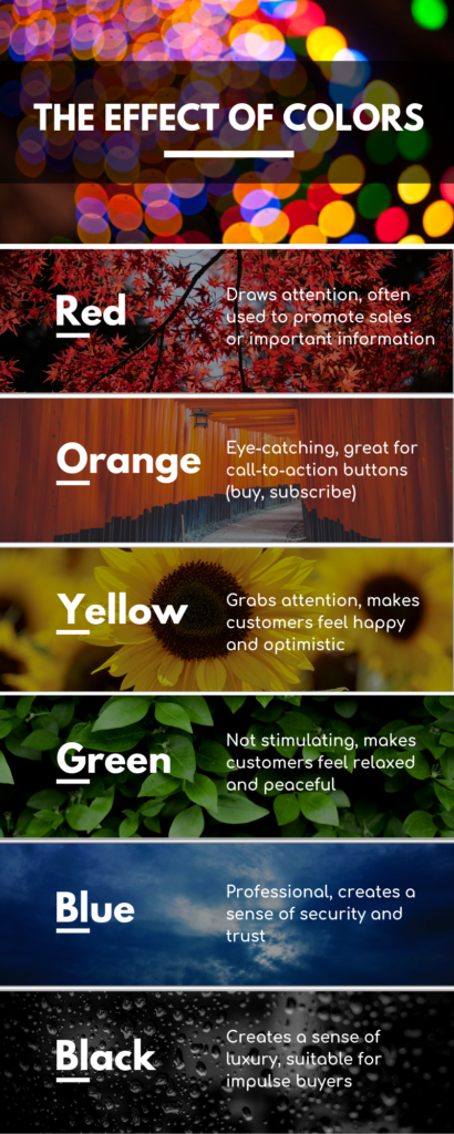
Colors prove to be an effective focus to grab the attention of the users on important and actionable elements. For instance, if you have chosen to swipe right for like and swipe left for dislike on your dating site, then wouldn’t it be feasible to use green color for the like button and red color for the dislike button?
Red is a very bright and powerful color and it showcases stop or no in traffic light, thus meaning that this is no option. While green on the other hand signifies go, so when you use green for like it means you giving the person a thumbs up.
Warmer shades like orange, yellow and red are naturally vibrant, eye-catching and attract your attention. They also expand when placed in contrast with colder shades like green and blue. This means if you choose the background of your dating site blue and then put orange tabs or button on it, it will appear like flowing outwards and using the front seat. While contrary, if you use an orange background with blue button, then it will contract inward wishing to be in the background.

How does color affect user action?
Function features like “Profile filling, video chat, live chat, profile visits” cannot be missed by the users. Hence, often designers set it against a red background so that it flashes widely from the dark background header, completely grabbing user attention.
For instance, Bumble. The website uses pastel and vibrant color mix to create a soothing and appealing appearance for their site. With different colors, users can take action for different tab they want.
OKCupid presents you with a pink, green and blue color website which justifies the complete ambience of the site. The pink and blue color makes the elements pop out at you. Hence, it gets simpler for the users to take action and do anything they want without laying too much stress on their eyes.
If you really want to get the “About” blurb on your dating site to get the highest user action, then you should make your background yellow. If you want to make the “join” tab attractive – use the orange color. Make sure you don’t highlight the tabs or elements too much. If you do so, they may get wiped out in each other’s company.
How does white space abridge the gap?
One of the major elements in grabbing user action is the white space between elements. It is the space between one interface element and the other. Whether it is the navigation bar, content, headline or button, you have to manipulate the white space to indicate the relationship between the elements.
For instance, use the black color headlines near the article to indicate that it is connected to the text. The white space makes the content and tabs more visible. Good designers quint the effect of colors from a distance while allowing them to see whether all the blocks are visible and well-separated from one another. If these colors or the text written on it is not visible properly, then it may require tweaking.
How can you make your website appealing for better user action with colors?
The effect of colors plays a vital role in the success or failure of a dating website. If you use too gaudy shades as the background or very dull colors to highlight the major corners of your dating site, then it will lead to poor results. A bad website isn’t just a result of poor alignment or bad content. It may also be a result of a bad color combination or a haphazard effect of color. With poor color choices, your website will never have any user action. Users prefer to surf a site and use it for long which has soothing effect on their mind.
When you choose a niche such as dating, then you have to be very particular about the colors you have chosen. Make sure the background has pastel or light shades. It produces a welcoming atmosphere for new visitors as people get very familiar and acquainted with these shades. Similarly, make sure the chat pop-up window is also very nice and charming. It should be eye-catching and have a sweet color tone.
Do not ever include gaudy or very bright colors in your website as it may discourage users from taking prompt action. They may get diverged by the color and switch to another site. The effect of colors has shown statistical changes in the success and fail of a dating website. Often users like to change the background of the chat window. You can provide your users with that option. They may use wallpapers or specific customized colors as per the preference.
With these mentioned points, you will certainly understand the effect of colors on user action. Use various colors wisely and achieve great results!
